Back to KPI list Urban Heat Island
 Urban Heat Island
 Urban Heat Island
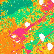 Urban Heat Island
Urban Heat Island
Risksv00.80 credits/per_km2
Responsible:Niccolò Calandri
Layer Urban Heat Island on real sites
Real Estate UK
Catania
Berlino Quarter
Mina el Cerrejon
Heat Islands
Overview
The Heat Islands KPI quantifies the intensity of the Urban Heat Island (UHI) effect across a monitored site. The UHI effect occurs when built-up areas record significantly higher average temperatures than surrounding rural zones — primarily due to the replacement of natural soils with heat-retaining materials such as concrete and asphalt, and the reduction of vegetated surfaces.
This KPI is implemented through two complementary satellite-derived indicators:
- UTFVI (Urban Thermal Field Variance Index): measures the intensity of the urban heat island effect at each pixel, scaled relative to the site's overall temperature range and the thermal baseline of non-urban areas. Analysed for April–August (warm season).
- Night LST (Nighttime Land Surface Temperature): measures ground surface temperature using satellite acquisitions at approximately 01:30 local time, downscaled from 1 km to 25 m resolution. Night-time data is particularly suited to detecting the UHI effect because daytime solar radiation adds noise to the thermal signal.
Both indicators are inverted: lower values indicate better (cooler) conditions. A site with minimal urbanisation and abundant vegetation will score at levels A or B; a heavily paved urban site will score at D or E.
The KPI is aligned with ESRS reporting topics E1-1, ESRS 2 IRO-1, AR 11, covering climate-related risks and transition dependencies.
Calculation Methodology
The system computes the Urban Thermal Field Variance Index (UTFVI) per pixel for each month in the warm season (April–August) using land surface temperature data. The formula normalises the pixel temperature against the thermal baseline of non-urban areas and the overall temperature range:
where LST_pixel = land surface temperature at the pixel (°C), T_nonurban,10p = 10th percentile of LST across non-urban, non-water pixels (thermal baseline of the rural/natural landscape), T_max / T_min = maximum and minimum LST across the entire analysis area
A cold-temperature cap is applied: when LST_pixel < 15 °C, UTFVI is capped at min(0.19, computed value), keeping winter or high-altitude pixels in level A/B.
Nighttime LST at 1 km resolution is downscaled to 25 m using a Random Forest model with NDVI, elevation, and land cover as predictor features. Data are sourced from MODIS Aqua/Terra LST (NASA) at 1,000 m resolution, ESA WorldCover at 10 m, and Sentinel-2 NDVI at 10 m.
What You See on the Platform
Overview > Highlights > "Heat islands" (Highlights Card)
Highlights Card. A card in the Overview > Highlights section summarising this KPI at a glance.
Purpose: To give a high-level signal of the heat island intensity status for the site at a glance.
Description: The card is labelled "Heat islands" with a flame/fire icon. It appears in the horizontal highlights strip alongside other KPI cards. The card shows the UTFVI quality level for the site. In the portfolio overview mode, the card aggregates information across all sites.
UTFVI Quality Scale
None< 0.2Weak0.2 – 0.4Moderate0.4 – 0.6Strong0.6 – 0.8Very strong> 0.8
How it's calculated: The displayed level is derived from the site's mean UTFVI value for the most recent analysis month in the warm season, mapped to the five-level quality scale (A–E).
Note: This indicator is inverted — lower values indicate better conditions.
Interpretation example:
If the card shows level "B" (green), the site has a mild UHI effect — vegetation and natural surfaces are still moderating temperatures. If it shows "D" (orange), significant thermal stress is present and mitigation actions are recommended.
Overview > Highlights > "Heat Islands" (Highlights Table Row)
Highlights Table Row. A row in the multi-site KPI comparison table in the Highlights section, labelled "Heat Islands", with the column header "Urban heat islands (SITE/CONTROL)".
Purpose: To compare the UHI intensity of each monitored site against its control area, and to rank sites within the portfolio.
Description: The row shows, for each site, two values side by side: the SITE (ROI) score and the CONTROL (CA) score, each expressed as a quality badge (Excellent / Ok / Concerning / Critical / Very critical). A tooltip on the column header reads: "Quantifies the intensity of localized warming in urbanized areas compared to surrounding rural areas."
How it's calculated: Each badge corresponds to the site's mean UTFVI value classified against the five-level inverted quality scale.
Note: This indicator is inverted — lower UTFVI values indicate better conditions.
Legend:
| Badge | UTFVI Range | Color |
|---|---|---|
| Excellent | < 0.2 | ■ #00A67A |
| Ok | 0.2 – 0.4 | ■ #00DF80 |
| Concerning | 0.4 – 0.6 | ■ #FFD21E |
| Critical | 0.6 – 0.8 | ■ #FF8B16 |
| Very critical | > 0.8 | ■ #FF367F |
Interpretation example:
If the Site badge shows "Concerning" (yellow) and the Control badge shows "Excellent" (green), the monitored site has a measurably higher UHI intensity than its control area — indicating that site urbanisation is generating localized thermal stress.
Assessment > Risks > "Heat islands" (Bubble Grid)
Bubble Grid. A 5-column x 5-row (or 6-row) grid showing the distribution of UTFVI levels across the site area for each month from April to August.
Purpose: To show how UHI intensity is distributed across the site area over the warm season, month by month.
Description: The chart is headed "Heat islands" under the "Thermal" group in the Risks section, with ESRS badge "E1-1, ESRS 2 IRO-1, AR 11". The grid has five columns (April through August) and five or six rows (UTFVI intensity levels). Each cell contains a proportional bubble scaled to the percentage of site area at that UTFVI level for that month. Larger bubbles mean more of the site is at that intensity level. The Site / Control Area toggle switches between ROI and CA data. Clicking a month column header opens a vertical legend sidebar showing the nighttime LST distribution for ROI vs CA, including Ua, FUa, and PUa index values.
How it's calculated: For each month and each UTFVI level, the percentage of site pixels falling in that level's range is computed. The bubble radius is scaled proportionally to this percentage.
Note: This indicator is inverted — lower UTFVI values indicate better conditions.
Legend:
| Row | UTFVI Level | Color |
|---|---|---|
| None | < 0.2 (level A) | ■ #22c55e |
| Weak | 0.2 – 0.4 (level B) | ■ #84cc16 |
| Moderate | 0.4 – 0.6 (level C) | ■ #facc15 |
| Strong | 0.6 – 0.8 (level D) | ■ #f97316 |
| Very strong | > 0.8 (level E) | ■ #ef4444 |
| Extreme | highest intensity | ■ #991b1b |
Interpretation example:
If in June the "None" row bubble is large (e.g., 70% of area) and "Strong" is small (5%), most of the site has negligible UHI effect in June — a positive signal. If the "Very strong" row grows from April to August, UHI intensity is worsening during the hottest months.
Assessment > Risks > "Heat islands (UTFVI)" (Assessment Sidebar Row)
Assessment Sidebar Row. A row in the Risks category of the assessment navigation sidebar, labelled "Heat islands (UTFVI)", showing UTFVI distribution bars for the site area.
Purpose: To give a quick-glance view of UTFVI distribution in the context of all risk indicators, accessible from any assessment page.
Description: The row shows the label "Heat islands (UTFVI)" and a set of horizontal proportional bars representing the percentage of site area at each UTFVI level. Each bar segment is coloured according to the level's color. The row appears on all assessment pages in the left sidebar under the Risks section.
How it's calculated: The bar proportions reflect the percentage of site pixels at each UTFVI level for the currently selected month in the warm season.
Note: This indicator is inverted — lower values indicate better conditions.
Legend:
| Level | Color |
|---|---|
| None (< 0.2) | ■ #22c55e |
| Weak (0.2 – 0.4) | ■ #84cc16 |
| Moderate (0.4 – 0.6) | ■ #facc15 |
| Strong (0.6 – 0.8) | ■ #f97316 |
| Very strong (> 0.8) | ■ #ef4444 |
| Extreme | ■ #991b1b |
Interpretation example:
If the sidebar bar shows mostly green (None/Weak), the site is largely free of urban heat island effects. Increasing orange and red segments indicate growing thermal stress.
Maps > Risks > "Urban heat islands" (Map Layer)
Map Layer. An interactive map overlay showing the spatial distribution of UTFVI intensity across the site area for a selected date in April–August.
Purpose: To show exactly where within the site urban heat island effects are strongest, enabling spatial identification of thermal hotspots.
Description: The map renders UTFVI values as a discrete 5-class colormap. Each pixel is coloured according to its UTFVI level (A–E). The layer is accessible under the "Risks" category tab in the map layer panel. An animated tooltip on the layer reads "Urban heat islands during {date}". An info tooltip explains: "The selected layer measures the intensity of heat islands in urban areas, providing insights into the impact of human activities on the local climate." When a UTFVI layer is generated, a Nighttime Temperature layer for the same date is automatically generated alongside it.
How it's calculated: Each pixel's UTFVI is computed from satellite LST and classified into one of five levels. The colormap is discrete with fixed boundaries at 0.2, 0.4, 0.6, and 0.8.
Note: This indicator is inverted — lower UTFVI values indicate better conditions.
Legend:
| Level | UTFVI Range | Color |
|---|---|---|
| A — None | < 0.2 | ■ #00A67A |
| B — Weak | 0.2 – 0.4 | ■ #00DF80 |
| C — Moderate | 0.4 – 0.6 | ■ #FFD21E |
| D — Strong | 0.6 – 0.8 | ■ #FF8B16 |
| E — Very strong | > 0.8 | ■ #FF367F |
Interpretation example:
If the map shows a predominantly green area (level A) with isolated orange patches (level D) near impervious surfaces, the majority of the site has minimal UHI effect; thermal hotspots are localised near sealed surfaces such as parking lots or rooftops.
Maps > Risks > "Surface Temperature Nighttime" (Map Layer)
Map Layer. An interactive map overlay showing the spatial distribution of nighttime land surface temperature across the site, downscaled to 25 m resolution.
Purpose: To provide a high-resolution spatial view of nighttime thermal conditions — the clearest signal for identifying where the UHI effect is strongest during the cooler hours of the day.
Description: The layer is listed as "Surface Temperature Nighttime" in the Risks category. An animated tooltip reads "Night temperature during the {week} week of {month}". The map uses a continuous jet colormap (blue = cooler, red = warmer), scaled dynamically to the data range of the site. An info tooltip explains: "The Night Temperature is the ground temperature estimated using nighttime satellite acquisitions. These acquisitions are ideal for studying the effects of Urban Heat Islands, as they highlight the most significant thermal differences between urban and rural environments." The panel also shows Ua, FUa, and PUa index values.
How it's calculated: Nighttime LST at 1 km resolution is downscaled to 25 m using a Random Forest model with NDVI, elevation, and land cover as features. The colormap is continuous and auto-scaled to the site's temperature range.
Note: This indicator is inverted — lower values indicate better conditions.
Interpretation example:
If the map shows a cool (blue) core in a wooded area and warm (red) patches over a parking area or industrial roof, the nighttime temperature contrast between vegetated and sealed surfaces is high — indicating active urban heat island formation at night.
Survey > Overview > "Urban heat islands" (Sites Progress Column)
Sites Progress Column. A column in the multi-site summary table showing the UTFVI quality badge for each monitored site (Site and Control Area values).
Purpose: To allow portfolio-level comparison of heat island intensity across all monitored sites at a glance.
Description: The column is headed "Urban heat islands (SITE/CONTROL)". Each row shows two quality badges — one for the Site (ROI) and one for the Control Area (CA) — using the five-level scale (Excellent / Ok / Concerning / Critical / Very critical). A tooltip on the header explains the indicator's meaning.
How it's calculated: The badge is assigned based on the site's mean UTFVI value classified against the five-level inverted quality scale.
Note: This indicator is inverted — lower UTFVI values indicate better conditions.
Legend:
| Badge | UTFVI Range | Color |
|---|---|---|
| Excellent | < 0.2 | ■ #00A67A |
| Ok | 0.2 – 0.4 | ■ #00DF80 |
| Concerning | 0.4 – 0.6 | ■ #FFD21E |
| Critical | 0.6 – 0.8 | ■ #FF8B16 |
| Very critical | > 0.8 | ■ #FF367F |
Interpretation example:
A site showing "Very critical" (red) next to a control area showing "Ok" (light green) indicates severe urban heat island intensity at the site relative to the surrounding landscape — a significant environmental risk.
Assessment > Trends > "Urban Heat Field Variance Index" (Line Chart)
Line Chart. A multi-year trend chart showing UTFVI values over time for the selected site.
Purpose: To track whether the urban heat island intensity at the site is improving, worsening, or stable over multiple years.
Description: The chart is accessible from the multi-year trends section. The trend type is labelled "Urban Heat Field Variance Index". The chart plots monthly or annual UTFVI values on the Y axis against time on the X axis. Site and Control Area trends are shown as separate lines.
How it's calculated: UTFVI values are computed for each available date in the April–August warm season window, using the same formula as the monthly maps.
Note: This indicator is inverted — lower values indicate better conditions.
Interpretation example:
If the Site line shows an increasing UTFVI trend over five years while the Control line remains stable, the site is experiencing growing urban heat stress — likely due to increased impervious surface area or loss of vegetation.
Data Sources
| Source | Provider | Coverage | Resolution | Period |
|---|---|---|---|---|
| MODIS Aqua LST (MYD11A1) | NASA | Global | 1,000 m | 2000 — present |
| MODIS Terra LST (MOD11A1) | NASA | Global | 1,000 m | 2000 — present |
| ESA WorldCover | ESA | Global | 10 m | 2020–2021 |
| Sentinel-2 L2A (NDVI) | ESA / Copernicus | Global | 10 m | 2017 — present |
| SRTM Elevation | NASA / USGS | ±60° latitude | 30 m | 2000 |
Detailed Methodology
UTFVI is computed per pixel for each month in the warm season (April–August). The pixel-level land surface temperature is compared against a non-urban thermal baseline (10th percentile of LST across non-urban, non-water pixels located more than 20 pixels from large urban areas) and normalised by the total temperature range across the analysis area.
A cold-temperature cap is applied: when pixel temperature drops below 15 °C, UTFVI is capped at min(0.19, computed value), keeping winter or high-altitude pixels from being misclassified.
UTFVI is computed per month for April–August, resulting in five monthly snapshots. For each month and each level, the percentage of site pixels falling within that level's range is computed. The monthly distribution feeds the bubble grid chart and the assessment sidebar.
Nighttime LST at 1 km resolution is downscaled to 25 m using a Random Forest model. No pre-trained model is stored — the model is fit fresh for each site on demand, using NDVI, elevation, and land cover as predictor features.
Three zone-based SUHI (Surface Urban Heat Island) indices compare urban pixel temperatures to surrounding rings:
- Ua (Urban-adjacent): temperature difference between the urban area and the immediately adjacent area
- FUa (Future Urban-adjacent): temperature difference between the urban area and the future urban expansion zone
- PUa (Peri-Urban-adjacent): temperature difference between the urban area and the peri-urban ring
Technical Notes
- The UHI KPI covers only the warm season: April–August. Outside this window, cold temperatures suppress the UHI signal and UTFVI may be affected by the cold-temperature cap (pixels below 15 °C are capped at UTFVI ≤ 0.19). Results should not be compared across seasons — only within the same warm-season window
- Two colour palettes are used for UTFVI in different parts of the platform: the assessment chart uses bright indicator colours, while the map layer uses the standard quality-scale colours. Both follow the same five-level A–E structure
- The assessment bubble grid uses a six-key classification (None / Weak / Moderate / Strong / Very strong / Extreme) while the formal quality scale and map colormap use five levels (A–E). The "Extreme" row corresponds to the upper tail of the E range
- The 1 km to 25 m nighttime LST downscaling uses a Random Forest model trained per request. For very uniform sites, the downscaling adds little additional information; for sites with strong topographic or vegetative gradients, fine-scale temperature patterns become visible
- Both MODIS Aqua and MODIS Terra data are available from 2000 onward. Cloud cover and data gaps may reduce coverage for specific months — the platform generates maps only when sufficient cloud-free acquisitions are available
- This KPI is closely related to Land Surface Temperature (LST), Natural Coverage, Impermeability, and NDVI — all of which are primary drivers of UHI intensity
Bibliography
- Oke, T.R. (1982). "The energetic basis of the urban heat island". Quarterly Journal of the Royal Meteorological Society, 108(455), 1–24. DOI: 10.1002/qj.49710845502
- Guha, S., et al. (2018). "Analytical study of land surface temperature with NDVI and NDBI using Landsat 8 OLI and TIRS data in Florence and Naples city, Italy". European Journal of Remote Sensing, 51(1), 667–678.
- NASA Land Processes Distributed Active Archive Center (LP DAAC). "MODIS/Aqua Land Surface Temperature and Emissivity Daily L3 Global 1km SIN Grid (MYD11A1)". Available at: lpdaac.usgs.gov
- ESA (2021). "ESA WorldCover 10 m 2020 v100". Available at: worldcover2020.esa.int
- European Commission (2022). "ESRS E1 — Climate Change". Corporate Sustainability Reporting Directive (CSRD). Available at: efrag.org