Back to KPI list Population Density
 Population Density
 Population Density
 Population Density
Population Density
Urbanizationv00.60 credits/per_km2
Responsible:Niccolò Calandri
Layer Population Density on real sites
Real Estate UK
Catania
Berlino Quarter
Mina el Cerrejon
Population Density (Inverted)
Overview
Population Density measures the number of inhabitants per hectare (inh/ha) within a study area, using the Global Human Settlement Layer (GHSL) dataset produced by the Joint Research Centre (JRC) of the European Commission. The indicator is available for epochs from 1975 to 2030 in five-year intervals, including projections for 2025 and 2030.
This KPI is an inverted indicator: a lower population density corresponds to lower anthropogenic pressure and better conditions for biodiversity. High-density areas are typically associated with soil sealing, habitat fragmentation, increased light and noise pollution, ecosystem degradation, and greater water stress.
The indicator is particularly useful for contextualising the ecological quality of a site relative to its degree of urbanisation and the cumulative impacts of human activities. It is only shown for sites larger than 10 hectares.
Calculation Methodology
Population density is derived from the GHSL GHS-POP dataset at 100 m native resolution (approximately 1 hectare per pixel). For each polygon, the mean of the population count raster values is computed and expressed in inhabitants per hectare. No unit conversion is needed — raw pixel values correspond directly to inh/ha.
GHSL encodes water bodies and sea areas as approximately −200; all negative values are masked out after download.
Data are sourced from the GHSL GHS-POP R2023A (JRC, European Commission) at 100 m resolution, covering epochs from 1975 to 2030 in five-year intervals.
What You See on the Platform
Assessment > Urbanization State > "Population Density" (Line Chart)
Line Chart. A time-series line chart showing population density (inh/ha) across all GHSL epochs from 1975 to 2030.
Purpose: To show how population density at the site or its control area has evolved over time and how it is projected to evolve in the near future.
Description: The chart displays one line at a time — either the Site (ROI) or the Control Area (CA) — toggled via a Site / Control switch at the top. The horizontal axis shows GHSL epochs (1975, 1980, ..., 2020, 2025, 2030), and the vertical axis shows density in inh/ha. Each data point is rendered as a colored circle, where the color reflects the quality level for that value (green for A, red for E). The two future epochs (2025 and 2030) are rendered as dashed segments at 50% opacity to signal that they are demographic projections, not measured values. A download button and source chip (GHSL) appear in the chart header.
How it's calculated: Each point is the mean population density (inh/ha) for the site polygon at the given GHSL epoch, derived from the GHS-POP raster at 100 m resolution. Point color is assigned by the quality ranges. The site must be larger than 10 ha for this chart to be displayed.
Note: This indicator is inverted — lower values indicate better conditions.
Legend:
| Level | Density (inh/ha) | Color | Meaning |
|---|---|---|---|
| A | 0–75 | ■ #00A67A | Rural; minimal anthropogenic pressure |
| B | 75–150 | ■ #00DF80 | Peri-urban; moderate pressure |
| C | 150–225 | ■ #FFD21E | Suburban; significant impact |
| D | 225–300 | ■ #FF8B16 | Dense urban; strong pressure |
| E | > 300 | ■ #FF367F | Very dense urban; severe habitat loss |
Interpretation example:
If the chart shows 12 inh/ha in 1975 rising to 45 inh/ha in 2020, with a projection of 55 inh/ha in 2030, it means the site is experiencing steadily growing anthropogenic pressure. A grade moving from A (1975) toward C–D (2020–2030) signals that biodiversity conditions are deteriorating over time.
Assessment > Urbanization State > "Population Density" (Vertical Legend)
Vertical Legend. A sidebar panel displayed alongside the line chart, showing the exact ROI and CA values at the currently selected year on a colour-coded vertical bar.
Purpose: To provide a precise, at-a-glance comparison between the site and the control area density at a specific point in time.
Description: The sidebar shows the KPI title ("Population density"), the measure unit (/ha), and two labelled markers — one for the Site (ROI) and one for the Control Area (CA) — positioned on a vertical colour gradient bar. The bar ranges from 0 to 300 inh/ha and is divided into four equal subdivisions. The currently selected year defaults to the epoch nearest to today's date. The sidebar is hidden when the chart is embedded in widget mode.
How it's calculated: Values displayed correspond to the population density for the selected epoch from the API response. The color bar uses the same inverted quality palette as the line chart data points.
Note: This indicator is inverted — lower values indicate better conditions.
Legend: Continuous gradient bar from ■ #00A67A (0 inh/ha, best) to ■ #FF367F (300 inh/ha, worst). Both the Site and Control markers are placed on this bar.
Interpretation example:
If the vertical legend shows Site = 3 inh/ha and Control = 85 inh/ha at year 2020, it means the site itself is sparsely populated, but it is situated within a dense urban control area — indicating surrounding development pressure even if the site polygon itself is relatively natural.
Maps > "Population density" (Map Layer)
Map Layer. An interactive raster overlay showing the spatial distribution of population density across the site and surrounding area for a selected GHSL epoch.
Purpose: To visualise where population is concentrated within and around the site, and to understand the spatial gradient of anthropogenic pressure.
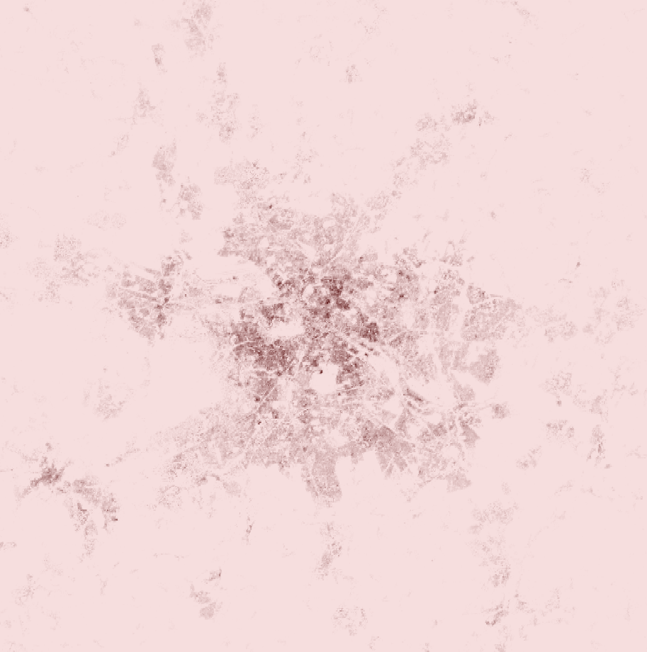
Description: The layer is selectable from the map layer dropdown under the name "Population density". Once active, the map tooltip reads "Population density (year)" — where the year is the selected epoch. The raster cells are coloured using a continuous gradient from pale pink to dark brown. A description tooltip explains the layer: "The selected layer, Population Density, indicates the number of inhabitants per hectare in a specific area, highlighting the anthropogenic pressure on the environment."
How it's calculated: Each raster pixel displays the raw population count value from GHS-POP at 100 m resolution for the selected epoch (1975–2030).
Note: This indicator is inverted — lower values indicate better conditions.
Legend: Continuous gradient: ■ #F6DEDE (pale pink, near 0 inh/ha) to ■ #4E0202 (dark brown, high density). The palette is not discretised — the darker the colour, the higher the density and the greater the anthropogenic pressure.
Interpretation example:
If the map shows a uniform pale-pink colour across the site polygon while the surrounding control area is dark brown, it means the site itself has very low population density and is surrounded by a highly urbanised area — a strong signal that the site represents a rare ecological refuge within a dense urban matrix.
Highlights > "Population Density" (Highlights Table Row)
Highlights Table Row. A single row in the KPI comparison highlights table on the Highlights page, showing the current population density value for the site alongside other KPIs.
Purpose: To provide a quick overview of population density alongside other key environmental indicators, enabling rapid multi-KPI comparisons across sites.
Description: The row is labelled "Population Density" and displays the current value (inh/ha) and grade for the site. It appears alongside other KPI rows such as MSA, Built-Up Surface, NDVI, and protected areas.
How it's calculated: The value and grade displayed come from the same API data as the assessment chart, using the most recent non-projection epoch.
Note: This indicator is inverted — lower values indicate better conditions.
Interpretation example:
If the Highlights table shows "Population Density: A — 32 inh/ha", it means the site has very low population density (< 75 inh/ha), indicating predominantly rural conditions with minimal anthropogenic pressure on biodiversity.
Data Sources
| Source | Provider | Coverage | Resolution | Period |
|---|---|---|---|---|
| GHSL GHS-POP R2023A | JRC — European Commission | Global | 100 m | 1975–2030 (5-year epochs) |
Detailed Methodology
Population density is derived from the GHSL GHS-POP R2023A dataset at 100 m native resolution. For each site polygon, the mean of the population count raster values is computed directly in inhabitants per hectare — no unit conversion is needed since each pixel covers approximately 1 hectare.
Water bodies and sea areas are encoded as approximately −200 in the source raster. All negative values are masked out after download so they do not affect the site-level average.
Epochs 2025 and 2030 are demographic projections based on UN urbanisation forecasts rather than measured satellite data. On the platform, these projected epochs are visually distinguished with dashed segments and reduced opacity.
For the map layer, each raster pixel displays the raw population count value at 100 m resolution for the selected epoch. The continuous color gradient (pale pink to dark brown) is applied without discretisation.
Technical Notes
- The GHSL dataset uses 100 m resolution, which makes it suitable for analysis of polygons down to approximately 1 hectare per pixel; sites smaller than 10 ha are excluded from the calculation
- Epochs 2025 and 2030 are projections based on demographic models and UN urbanisation forecasts — they are not measured values and should be interpreted with caution
- Historical epochs (1975–2020) are derived from satellite Earth observation combined with census data and are considered reliable retrospective estimates
- Water and sea areas are encoded as approximately −200; these negative values are masked out and do not affect the site-level average
- This KPI is closely related to Built-Up Surface and Degree of Urbanization: high population density typically co-occurs with high built-up surface and urban degree, making these three indicators complementary for assessing urbanisation pressure
- The indicator is particularly discriminating in urban-rural transition zones, where density gradients are steep and small polygon differences can yield large grade changes
- Update frequency: the GHSL dataset is updated when a new release becomes available (approximately every 3–5 years); the current version is R2023A
Bibliography
- Schiavina, M., Freire, S., Carioli, A., MacManus, K. (2023). GHS-POP R2023A — GHS population grid multitemporal (1975-2030). European Commission, Joint Research Centre (JRC). DOI: 10.2905/2FF68A52-5B5B-4A22-8F40-C41DA8332CFE
- Pesaresi, M., et al. (2024). "Advances on the Global Human Settlement Layer by joint assessment of Earth Observation and population survey data." International Journal of Digital Earth.
- UN DESA (2018). World Urbanization Prospects: The 2018 Revision. United Nations, Department of Economic and Social Affairs. https://population.un.org/wup/