Back to KPI list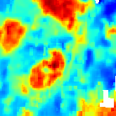 Land Surface Temperature
 Land Surface Temperature
 Land Surface Temperature
 Land Surface Temperature
Land Surface Temperature
Risksv00.60 credits/per_km2
Responsible:Niccolò Calandri
Layer Land Surface Temperature on real sites
Real Estate UK
Catania
Berlino Quarter
Mina el Cerrejon
Land Surface Temperature (LST)
Overview
Land Surface Temperature (LST) is the measurement of the temperature of the Earth's surface, distinct from the air temperature measured by meteorological stations. Expressed in degrees Celsius (°C), LST provides a direct indicator of the effects of global warming and climate change on the land surface, with particular relevance for assessing the Urban Heat Island (UHI) effect and thermal stress conditions of ecosystems.
High LST values are associated with soil sealing, reduced vegetation cover, increased evapotranspiration under water stress, and reduced ecosystem cooling services. Lower surface temperatures indicate more favourable conditions for biodiversity and ecosystems.
The KPI is derived from Landsat 8 satellite thermal imagery at 30 m resolution, averaging the summer months (June, July, August) to capture the annual thermal peak. It is reported in degrees Celsius and covers all monitored sites globally.
Calculation Methodology
The Land Surface Temperature is derived from satellite thermal infrared data. Raw digital numbers (DN) from the thermal band are converted to surface temperature using calibration coefficients:
where DN = digital number from the Landsat 8 thermal band (ST_B10)
The calculation averages the summer months (June, July, August) to capture the annual thermal peak. Data are sourced from the Landsat 8 / Landsat 9 dataset (NASA / USGS) at 30 m spatial resolution, available from 2013 to the present.
What You See on the Platform
Assessment > Risks > "Soil temperature" (Gauge)
Gauge. A semicircular arc gauge displaying the mean Land Surface Temperature for the site (ROI arc) and the control area (CA arc), with a delta badge comparing the two.
Purpose: To answer the question "How hot is the ground surface at this site compared to its control area?" and to contextualise the result against the A-E quality scale.
Description: The card is titled "Soil temperature" and carries the sub-topic badge "E1-1, ESRS 2 IRO-1, AR 11". A sun icon appears next to the title. The gauge shows two arcs: the outer arc represents the site (ROI) and the inner arc the control area (CA). The current mean temperature in °C is displayed at the centre of the gauge, along with a delta badge (e.g., +4.0°C) showing the difference between ROI and CA. Numeric rows below show the exact ROI and CA values against their respective benchmarks.
38°CLand Surface Temperature
How it's calculated: The displayed value is the spatial mean of LST (°C) over the site polygon, averaged across June, July, and August. The CA value is the same calculation applied to the control area polygon. The delta badge is ROI minus CA. The colour of each arc is determined by the quality level thresholds (A-E scale).
Note: This indicator is inverted -- higher values indicate worse conditions (more thermal stress, stronger heat island effect). A higher ROI temperature relative to CA is an adverse signal.
Legend:
| Level | LST (°C) | Color | Meaning |
|---|---|---|---|
| A | < 35 | ■ #00A67A | Low temperature; good vegetation cooling |
| B | 35 -- 40 | ■ #00DF80 | Normal summer temperature in temperate zones |
| C | 40 -- 45 | ■ #FFD21E | Moderately elevated; peri-urban or sparse cover |
| D | 45 -- 50 | ■ #FF8B16 | High; dense urban with heat island effect |
| E | > 50 | ■ #FF367F | Extreme; severe heat island and thermal stress |
Interpretation example:
If ROI shows 32°C (grade A, green) and CA shows 28°C, the site is thermally cool relative to the quality thresholds and only 4°C warmer than its control area -- a healthy thermal profile. If ROI shows 48°C (grade D, orange) and CA shows 38°C, the +10°C delta indicates a significant urban heat island effect at the site.
Maps > "Land Surface Temperature" (Map Layer)
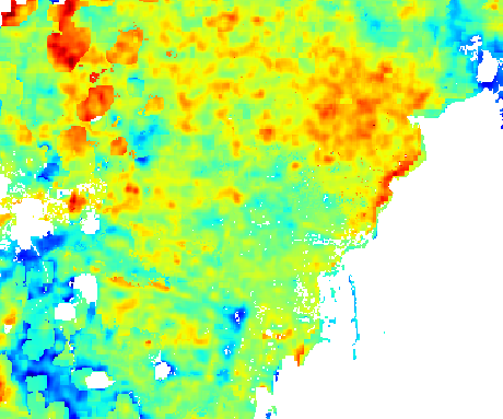
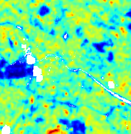
Map Layer. An interactive map overlay showing the daytime Land Surface Temperature across the site and surroundings, rendered as a continuous colour gradient from the jet colormap.
Purpose: To provide a spatially resolved view of surface temperature across the site, identifying hotspots and cooler zones.
Description: When the "Land Surface Temperature" layer chip is selected in the map panel, the satellite-derived LST raster is displayed over the base map. The legend panel shows the title "Ground temperature in [month year]" with a continuous colour gradient bar. The layer selector also offers three related variants as separate chips: "LST annual range", "LST range delta between years", and "Night Land Surface Temperature".
LST Scale
CoolHotVery low surface temperatureExtreme surface heat
How it's calculated: The raster is derived from Landsat 8 thermal imagery processed using the same methodology as the Assessment gauge. The colour scale auto-adjusts dynamically to the data range of each image (no fixed bounds).
Note: This indicator is inverted -- cooler areas (blue/green on the jet colormap) represent better ecological conditions than hotter areas (red/dark red).
Legend: The map uses a continuous jet colormap ranging from cool (dark blue) to hot (dark red). The scale auto-adjusts to the image data range.
| Color | Approximate Temp | Meaning |
|---|---|---|
■ #000080 (dark blue) | Coolest values | Very low surface temperature |
■ #00ffff (cyan) | Low-moderate | Cool, vegetated areas |
■ #ffff00 (yellow) | Moderate | Mixed cover |
■ #ff0000 (red) | High | Urban or bare soil |
■ #800000 (dark red) | Hottest values | Extreme surface heat |
Interpretation example:
If the map shows a dark-red zone concentrated over a car park or industrial rooftop and a cyan zone over an adjacent woodland, the thermal contrast illustrates the cooling benefit of vegetation relative to impervious surfaces.
Maps > "LST annual range" (Map Layer)
Map Layer. An interactive map overlay showing the annual temperature range (maximum minus minimum seasonal LST) for the site.
Purpose: To identify zones with high seasonal temperature variability, which may indicate areas of particular thermal stress or strong continental climate influence.
Description: When the "LST annual range" chip is selected, the raster shows the difference between the warmest and coolest season's LST across the year. If this layer has not yet been generated for the site, a "Generate LST Annual Range" button is shown instead.
How it's calculated: The annual range is the pixel-wise difference between the maximum and minimum seasonal LST values derived from Landsat 8 imagery across all available seasons in the reference period.
Note: This indicator is inverted -- higher annual range values indicate greater thermal instability, which is ecologically less favourable.
Interpretation example:
A zone showing a 25°C annual range experiences extreme temperature swings between winter and summer -- this indicates strong seasonal thermal stress that can affect plant phenology and soil moisture dynamics.
Maps > "LST range delta between years" (Map Layer)
Map Layer. An interactive map overlay showing the change in LST annual range between consecutive years (or between reference years).
Purpose: To detect whether thermal variability at the site is increasing or decreasing over time -- an indicator of climate trend direction.
Description: When the "LST range delta between years" chip is selected, the raster shows per-pixel delta values (positive = increasing range, negative = decreasing range). If not yet generated, a "Generate LST Range Delta" button is shown.
How it's calculated: The delta is computed as the LST annual range for the most recent period minus the LST annual range for the previous period, pixel by pixel.
Note: This indicator is inverted -- a positive delta (increasing range) represents worsening thermal conditions.
Interpretation example:
A site showing a positive delta of +3°C across its industrial zone indicates that the seasonal temperature swing has widened by 3°C compared to the previous year -- a signal of intensifying urban heat island dynamics.
Maps > "Night Land Surface Temperature" (Map Layer)
Map Layer. An interactive map overlay showing the nighttime Land Surface Temperature, derived from nighttime satellite acquisitions and downscaled to 25 m using a machine-learning model.
Purpose: To study the effects of Urban Heat Islands, which are most pronounced at night when surfaces that absorbed solar radiation during the day continue to re-emit heat.
Description: When the "Night Land Surface Temperature" chip is selected, the nighttime LST raster is displayed. The legend shows "Night temperature during the [week] week of [month]". This layer is linked to the Urban Heat Island (UTFVI) map: generating a UHI map also generates a Nighttime Temperature map for the same date. An info button opens the Night LST info dialog, which explains three temperature-difference indices: FUa (Future Urban-adjacent), PUa (Peri-Urban-adjacent), and Ua (Urban-adjacent).
How it's calculated: Nighttime surface temperature is estimated from MODIS 1 km nighttime LST data, downscaled to 25 m resolution using a Random Forest model trained on Sentinel-2 NDVI, ESA WorldCover, and SRTM elevation as auxiliary features.
Note: This indicator is inverted -- higher nighttime temperatures indicate stronger heat island retention and worse ecological conditions.
Interpretation example:
If nighttime LST shows 28°C in the urban core and 18°C in the rural surroundings, the 10°C differential is a strong Urban Heat Island signal -- vegetation in the rural buffer is providing significant nocturnal cooling services.
Overview > Highlights > "Heat islands" (Highlights Card)
Highlights Card. A summary card in the Overview > Highlights section showing the heat island status for the site, based on the UTFVI (Urban Thermal Field Variance Index) indicator which is directly derived from LST.
Purpose: To give a quick overview of the site's heat island intensity alongside other key environmental indicators.
Description: The card is labelled "Heat islands" and displays the computed heat island metric for the site. A colour badge indicates the quality grade.
How it's calculated: The heat island metric is computed from LST data using the UTFVI algorithm, which compares urban area temperatures to surrounding rural reference temperatures.
Note: This indicator is inverted -- higher heat island values indicate worse ecological conditions.
Interpretation example:
A "Heat islands" card showing a red badge (grade E) indicates extreme urban heat island intensity -- the site temperature is significantly elevated above surrounding rural areas.
Overview > Highlights > "Surface Temperature" (Highlights Table Row)
Highlights Table Row. A row in the KPI comparison table within the Highlights section, labelled "Surface Temperature", showing the LST value and grade for the site in the "Risk" category group.
Purpose: To provide a scannable comparison of the site's LST performance alongside other risk-category KPIs in a single table view.
Description: The row appears under the "Risk" section of the highlights table. It shows the KPI label "Surface Temperature", the current grade badge (A-E), and the numeric value in °C.
How it's calculated: Same as the Assessment gauge -- spatial mean LST for the summer period, graded A-E against the quality thresholds.
Note: This indicator is inverted -- a grade of E (pink/red) means the site has extreme surface heat; a grade of A (green) means cool, well-vegetated conditions.
Interpretation example:
If the "Surface Temperature" row shows grade B (light green) and 37°C, the site has a normal summer surface temperature for a temperate location -- within the acceptable range and just above the threshold for excellent (A).
Sites Progress > "Soil temperature (SITE/CONTROL)" (Sites Progress Column)
Sites Progress Column. A column in the multi-site comparison table at the Sites Progress view, showing both the site (ROI) and control area (CA) LST values for each monitored site.
Purpose: To allow portfolio managers to compare surface temperature performance across all monitored sites in a single table.
Description: The column header reads "Soil temperature (SITE/CONTROL)" with a tooltip "Soil surface temperature (Land Surface Temperature)." Each cell shows the site and control area LST values as a dual badge. The column is filterable and sortable.
How it's calculated: Same spatial mean LST calculation as the Assessment gauge, applied to each site's polygon and its associated control area polygon.
Note: This indicator is inverted -- lower temperature values indicate better ecological performance for this column.
Interpretation example:
A cell showing 33°C / 29°C (Site / Control) in green indicates both the site and control area are in grade A territory -- cool, healthy conditions. A cell showing 47°C / 41°C in orange indicates the site is experiencing significant heat stress above the control reference.
Multi-Year Trends > "Soil Surface Temperature" (Line Chart)
Line Chart. A time-series chart showing the evolution of Land Surface Temperature at the site across multiple years, accessible from the Multi-Year Trends section.
Purpose: To reveal whether the site's surface temperature is increasing, decreasing, or stable over time -- a direct indicator of climate change impact at the local scale.
Description: The trend type selector shows "Soil Surface Temperature" as one of the available trend types. The chart displays annual LST mean values plotted over time (year on the X axis, °C on the Y axis). The site and control area trends may be shown simultaneously.
How it's calculated: Each annual data point is the summer mean LST for that year, computed using the same Landsat 8 methodology. Years with insufficient cloud-free data are omitted or use the adaptive substitute month.
Note: This indicator is inverted -- an upward trend in the chart represents worsening conditions (increasing thermal stress).
Interpretation example:
If the chart shows LST rising from 33°C in 2015 to 39°C in 2025 at the site (from grade A to grade B territory), this 6°C increase over ten years signals a measurable warming trend -- likely driven by a combination of climate change and local land-use change.
Data Sources
| Source | Provider | Coverage | Resolution | Period |
|---|---|---|---|---|
| Landsat 8 / Landsat 9 -- Thermal Infrared band (ST_B10) | NASA / USGS | Global | 30 m (thermal resampled from 100 m) | 2013 -- present |
| MODIS Terra LST (MOD11A1) | NASA | Global | 1000 m | 2000 -- present |
| MODIS Aqua LST (MYD11A1) | NASA | Global | 1000 m | 2000 -- present |
| ESA WorldCover | ESA | Global | 10 m | 2020-2021 |
| Sentinel-2 L2A | ESA / Copernicus | Global | 10 m | 2017 -- present |
| SRTM Elevation | NASA / USGS | +/-60° latitude | 30 m | 2000 |
Note: Daytime LST uses Landsat 8/9 only. The MODIS sources and auxiliary data are used exclusively for the nighttime LST product.
Detailed Methodology
The calculation uses the Landsat 8 dataset (NASA / USGS, 30 m spatial resolution), available from 2013 to the present via the Thermal Infrared (TIR) band. The process follows these steps:
- Summer period selection -- the mean of June, July, and August (warm season) is computed. If June is unavailable due to insufficient clear-sky data, May is used instead; if August is unavailable, September is used.
- Cloud filtering -- cloudy pixels are removed using the quality assessment band with a dynamic threshold: starting at 20% cloud coverage and increasing up to 100% if insufficient data are available.
- Temperature conversion -- DN values from the thermal band are converted to surface temperature (°C) using Landsat calibration coefficients.
- Spatial averaging -- the mean LST value is computed across all pixels within the site polygon for the selected period.
For the nighttime product, MODIS 1 km nighttime LST data are downscaled to 25 m resolution using a Random Forest model trained on Sentinel-2 NDVI, ESA WorldCover, and SRTM elevation as auxiliary features.
Technical Notes
- LST is the radiative skin temperature of the Earth's surface -- it can differ from air temperature by up to +10-20°C on impervious surfaces (asphalt, rooftops) in summer; do not compare LST values directly with meteorological temperature readings
- The summer mean is computed over June, July, and August to capture the annual thermal peak; if a month lacks sufficient cloud-free observations, an adjacent month is substituted: May replaces June, September replaces August
- Cloud removal uses a dynamic threshold that starts at 20% and relaxes up to 100% to maximise data availability in persistently cloudy regions
- Landsat 8 has a 16-day orbital revisit cycle; in regions with persistent cloud cover the seasonal mean may be based on a limited number of scenes, reducing reliability
- The quality thresholds (A-E) are [< 35, 35-40, 40-45, 45-50, > 50°C] and are delivered to the platform via API; if API ranges are not available, the platform uses a frontend fallback that may differ from these authoritative thresholds
- The nighttime LST product uses MODIS data downscaled to 25 m via Random Forest; its quality thresholds and methodology differ from the daytime product and are documented under the Heat Islands (UTFVI) KPI
- Related KPIs: Heat Islands (UTFVI) quantifies urban heat island intensity derived from LST; Nighttime Land Surface Temperature is the nocturnal equivalent; Climate Change tracks long-term temperature trends
- Data update frequency: annually, as new Landsat imagery becomes available
Bibliography
- Jimenez-Munoz, J. C., Sobrino, J. A., Skokovic, D., Mattar, C., Cristobal, J. (2014). "Land Surface Temperature Retrieval Methods From Landsat-8 Thermal Infrared Sensor Data". IEEE Geoscience and Remote Sensing Letters, 11(10), 1840-1843. DOI: 10.1109/LGRS.2014.2312032
- Weng, Q., Lu, D., Schubring, J. (2004). "Estimation of land surface temperature-vegetation abundance relationship for urban heat island studies". Remote Sensing of Environment, 89(4), 467-483.
- Voogt, J. A., Oke, T. R. (2003). "Thermal remote sensing of urban climates". Remote Sensing of Environment, 86(3), 370-384.
- NASA / USGS (2013-present). "Landsat 8 Collection 2 Level-2 Science Products". USGS Earth Resources Observation and Science (EROS) Center. Available at: usgs.gov -- Landsat Collection 2
- European Environment Agency (2022). "Urban heat islands -- European Environment Agency". Available at: eea.europa.eu