Back to KPI list Built-Up Surface
 Built-Up Surface
 Built-Up Surface
 Built-Up Surface
Built-Up Surface
Urbanizationv10.60 credits/per_km2
Responsible:Niccolò Calandri
Layer Built-Up Surface on real sites
Real Estate UK
Catania
Berlino Quarter
Mina el Cerrejon
Built-Up Surface Fraction (BUSF)
Overview
The Built-Up Surface Fraction (BUSF) measures the percentage of land covered by buildings, roads, and other human infrastructure within a monitored area. Derived from satellite imagery at 100 m resolution, it quantifies the footprint of urbanisation at each GHSL epoch available — spanning from 1975 to 2030, including projected values for future years.
This KPI is inverted: a lower percentage is ecologically better. Natural soils, vegetation, and permeable surfaces support biodiversity, climate regulation, water infiltration, and habitat connectivity. Every percentage point gained by built-up surfaces represents a direct reduction in available habitat and soil function. The indicator aligns with the ESRS E4 framework (biodiversity and ecosystem services) and the E4 Urbanisation topic.
Unlike land cover or vegetation indices, BUSF directly measures impervious human footprint without relying on land use classifications, making it a robust, globally consistent proxy for habitat loss pressure.
Calculation Methodology
The BUSF value is computed from the Global Human Settlement Layer (GHSL) GHS_BUILT_S product, which maps built-up surface area in m² per 100 m x 100 m cell. The raw pixel value is converted to a percentage:
where Built-up surface = satellite-derived built-up area within each 100 m x 100 m grid cell, 10,000 = total cell area in m²
The platform aggregates pixel values across all cells within the site boundary (ROI) and the control area (CA), producing mean percentages for each. Data are sourced from GHSL GHS_BUILT_S R2023A (JRC, European Commission) at 100 m resolution, covering epochs from 1975 to 2030 in 5-year intervals.
What You See on the Platform
Maps > "Built-Up Surface" (Map Layer)
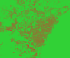
Map Layer. A full-screen raster overlay rendered on the site map, showing the spatial distribution of built-up surface fraction at a selected GHSL epoch.
Purpose: Where within the site boundary is built-up infrastructure concentrated, and how does spatial density vary across the area?
Description: The map layer paints each 100 m x 100 m pixel with a colour derived from the BUSF value at that cell. The colour scale runs from green (low built-up %) through red (high built-up %). A date selector allows switching between available GHSL epochs. A legend and metadata panel show the minimum, mean, and maximum pixel values for the displayed image. The layer label reads "Built-up area (YYYY)" where YYYY is the selected year.
How it's calculated: Each pixel value is (built-up surface m² / 10,000) x 100. The colour mapping uses a continuous linear gradient normalised dynamically per image.
Note: This indicator is inverted — lower values indicate better conditions.
Legend:
The map uses a continuous gradient:
■ #31D136 — Low built-up (near 0%) --> ■ #D13131 — High built-up (near 100%)
Interpretation example:
If the map shows a predominantly green site with isolated red patches along the perimeter road, it means the core habitat area retains low built-up cover, while the boundary experiences concentrated infrastructure pressure — a typical pattern for protected natural areas adjacent to roads.
Assessment > Urbanization State > "Built-Up Surface" (Line Chart)
Line Chart. A time series chart showing the evolution of built-up surface percentage across GHSL epochs, comparing the site (ROI) against the control area (CA).
Purpose: Has the built-up footprint of this site increased, stabilised, or decreased over decades, and how does this trend compare to the surrounding control area?
Description: The chart plots the mean BUSF % on the Y-axis against GHSL epoch years (1975-2030) on the X-axis. Two lines are shown: one for the site (ROI) and one for the control area (CA, toggle-enabled). A year selector highlights the selected epoch with a vertical marker. The section title reads "Built-up area (YYYY)". A quality colour band may be overlaid to contextualise the values against the A-E grade scale. A source attribution link appears below the chart.
How it's calculated: Each epoch value is the mean built-up fraction across all pixels within the site or control boundary, converted to percentage. The trend is drawn by connecting successive epoch means. Years 2025 and 2030 are model projections.
Note: This indicator is inverted — lower values indicate better conditions.
Interpretation example:
If the ROI line rises from 4% in 1975 to 18% in 2020, while the CA line rises from 3% to 8%, it means the site has experienced disproportionately higher urbanisation than its surroundings over 45 years — a significant biodiversity pressure signal.
Overview > Highlights > "Built-up Area" (Highlights Table Row)
Highlights Table Row. A row in the multi-KPI comparison table on the Highlights page, showing the latest available built-up surface percentage for the site and control area side by side.
Purpose: At a glance, how does the site's built-up footprint compare to the control area, and which quality grade does it fall into?
Description: The row displays the label "Built-up Area", the latest ROI value (%), the latest CA value (%), a grade badge (A-E), and the delta (Site - Control, with sign). The row is positioned in the biodiversity-topic group of the highlights table. Values are sourced from the most recent available GHSL epoch.
How it's calculated: The displayed values are the last entry in the ROI and CA trend arrays. The grade is assigned using the inverted quality thresholds (A = 0-20%, E = 80-100%). The delta is ROI - CA.
Note: This indicator is inverted — lower values indicate better conditions.
Legend:
| Grade | Range (%) | Color | Meaning |
|---|---|---|---|
| A | 0 - 20 | ■ #00A67A | Minimal built-up — predominantly natural |
| B | 20 - 40 | ■ #00DF80 | Low built-up — good habitat availability |
| C | 40 - 60 | ■ #FFD21E | Moderate built-up — fragmented habitat |
| D | 60 - 80 | ■ #FF8B16 | High built-up — heavily reduced habitat |
| E | 80 - 100 | ■ #FF367F | Extreme built-up — habitat almost absent |
Interpretation example:
If this row shows 12% (A) for the Site and 6% (A) for the Control with a delta of +6%, it means both areas are in excellent condition, but the site is twice as built-up as its surroundings — a difference worth monitoring over time.
Assessment > Sidebar > E4 Biodiversity > "Built-Up Surface" (Assessment Sidebar Row)
Assessment Sidebar Row. A grade row in the collapsible E4 Biodiversity panel of the left-hand assessment sidebar, displaying site and control BUSF values for the urbanisation sub-topic.
Purpose: How does the site's built-up surface fraction score within the E4 biodiversity assessment, compared to the control area?
Description: The sidebar row shows the label "Built-Up Surface" with two sub-values side by side: "Site" (%) and "Control" (%). A grade badge (A-E) appears based on the site value. The row is part of the collapsible E4 Biodiversity / Urbanization section. This sidebar allows quick cross-KPI comparison across all E4 sub-indicators.
How it's calculated: The site and control values are the latest mean BUSF %. The grade assignment uses the same inverted thresholds as the highlights table row.
Note: This indicator is inverted — lower values indicate better conditions.
Interpretation example:
If the sidebar row shows Site: 15% / Control: 8% / Grade B, it means the site is in good condition (low built-up) but slightly more urbanised than the surrounding reference area.
Map > Site Sidebar > Land Use > "BUSF" (Detail Card)
Detail Card. A compact KPI card in the Land Use section of the iLoveNatura public map widget's site detail sidebar, showing the built-up surface fraction for the site and control area.
Purpose: What is the current built-up fraction of this site, and how does it compare to the surrounding area?
Description: The card displays the label "BUSF" with the subtitle "Built-Up Surface Fraction". Below, two values are shown: ROI (%) and CA (%). A colour chip indicates the quality grade. The card is clickable — clicking activates the BUSF map layer overlay for the site. The icon is a building symbol.
How it's calculated: The values are the latest mean BUSF %. Colour coding uses the standard A-E inverted grade scale.
Note: This indicator is inverted — lower values indicate better conditions.
Interpretation example:
If the card shows BUSF: 8% with a green (A) chip, it means the site has minimal built-up cover — well within the excellent range — indicating abundant natural land available for biodiversity and ecosystem services.
Data Sources
| Source | Provider | Coverage | Resolution | Period |
|---|---|---|---|---|
| GHSL GHS_BUILT_S R2023A | JRC — European Commission | Global | 100 m | 1975-2030 (5-year epochs) |
Detailed Methodology
The raw raster tile is loaded from the GHSL GHS_BUILT_S product. The pixel value represents built-up surface in m² per 100 m x 100 m cell. A percentage conversion is applied: (value / 10,000) x 100.
The platform aggregates pixel values across all cells within the site boundary (ROI) and the control area (CA), producing mean percentages for each. Available GHSL epochs are: 1975, 1980, 1985, 1990, 1995, 2000, 2005, 2010, 2015, 2020, 2025, 2030. The 2025 and 2030 values are model projections rather than observed data.
A v1 calibration step shifts historical trend values so that the 2025 epoch aligns with land cover percentage estimates from the CLC pipeline, ensuring internal consistency between indicators.
For large sites (greater than 25 km x 25 km), the area is split into overlapping quadrants with 5% overlap and merged using the maximum value per pixel.
The quality grade thresholds are inverted (lower = better): A = 0-20%, B = 20-40%, C = 40-60%, D = 60-80%, E = 80-100%.
Technical Notes
- Data epochs are available in 5-year intervals from 1975 to 2020. The 2025 and 2030 values are modelled projections based on observed trends — interpret them with caution rather than as confirmed observations
- The native GHSL resolution is 100 m per pixel. The platform database description refers to "10 m resolution", which is an error in the source description; the actual resolution is 100 m
- For large sites exceeding approximately 25 km x 25 km, processing splits the area into overlapping quadrants with 5% overlap and merges results using the maximum value per pixel, which may slightly overestimate built-up cover near quadrant boundaries
- The quality grade thresholds (A: 0-20%, B: 20-40%, C: 40-60%, D: 60-80%, E: 80-100%) represent global standards and may not reflect local context — dense cities will typically score D or E, while rural nature reserves should score A
- BUSF is closely related to the Urbanization Degree (DU) indicator, which combines built-up surface with population density — for a complete picture of urbanisation pressure, consult both KPIs together
- This KPI contributes to ESRS E4 disclosure requirements (biodiversity and ecosystem services), specifically the E4 Urbanisation sub-topic
Bibliography
- Pesaresi, M., et al. (2024). "Advances on the Global Human Settlement Layer by Joint Analysis of Earth Observation Data and Population Estimates." International Journal of Digital Earth, 17(1). DOI: 10.1080/17538947.2024.2390454
- Pesaresi, M. & Politis, P. (2023). GHS-BUILT-S R2023A — GHS built-up surface grid, derived from Sentinel2 composite and Landsat, multitemporal (1975-2030). European Commission, Joint Research Centre (JRC). DOI: 10.2905/9F06F36F-4B11-47EC-ABB0-4F8B7B1D72EA
- European Commission, Joint Research Centre. (2023). GHSL — Global Human Settlement Layer. https://ghsl.jrc.ec.europa.eu/